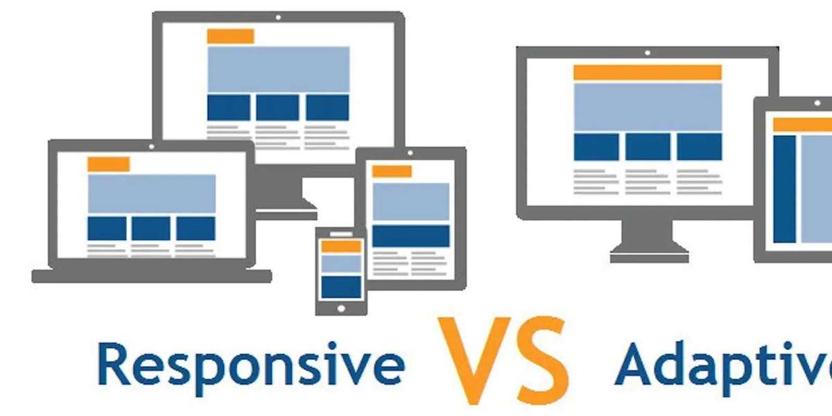
Let’s begin with some facts! According to the survey report, 90% of internet users surf through their smartphones, which eventually means more than 50% of the traffic of any website is generated through smartphones.
So, it becomes a compulsion for the website design to tap mobile users since most traffic sources are smartphones. You need to develop a website design that is compatible with smartphone users and delivers a good customer experience.
To scale your website for different screen sizes, responsive and adaptive web design methodology works. But, what’s more, an effective approach for the user as well as you (the designer) matters.
Thus, to help you choose the right approach, the website designing company in delhi has brought you an in-depth comparison.
But, before getting into it, let’s understand what they are.
What is responsive web design?
In responsive web design, a single layout is used and it responsively alters to appropriately fit different screen sizes, no matter which device it is.
In technical terms, when you are choosing a responsive web design use media queries to strike breakpoints. This helps to wrap texts, scale images, and alter the layout to fit different sizes of the screen.
For this, you can use the following programming languages such as HTML, CSS, HTML5, and CSS3.
Here are a few pros and cons of responsive web design:
Pros:
For the designer, they less work and more time to brainstorm on creation. Responsive websites are easy to maintain. It is also compatible with almost every screen size. Responsive web designs are more mobile-friendly and at the same time, SEO-friendly as well. This approach can also tend to save your resources.
Cons:
Responsive web design takes a bit more time to load. Some uncertainties, such as uncontrollable layout for every device can lead to degrading the customer experience.
What is adaptive web design?
Adaptive design uses different fixed layouts that are suitable for different screen sizes. For this, you need to have multiple versions of a web page. This type of web page is reordered and remains similar to the original one.
The myth with adaptive web design is that many thinks, you need to develop separate sites. Through this approach, you can maintain all your content in a single place and make use of the same content with every adaption. In adaptive sites, you need to have a primed template for each device.


